Rolex Day-Date 40,
first place.
A beginner-stage Illustrator competition entry that became a milestone: a fully built gold watch, constructed through outlines, gradients, reflections, dial details and a complete process board.
Before the portfolio and the larger cinematic pieces, this was one of the first moments that proved the work could compete. Placing first among about two hundred made the process feel real.
Gold, gloss and control.
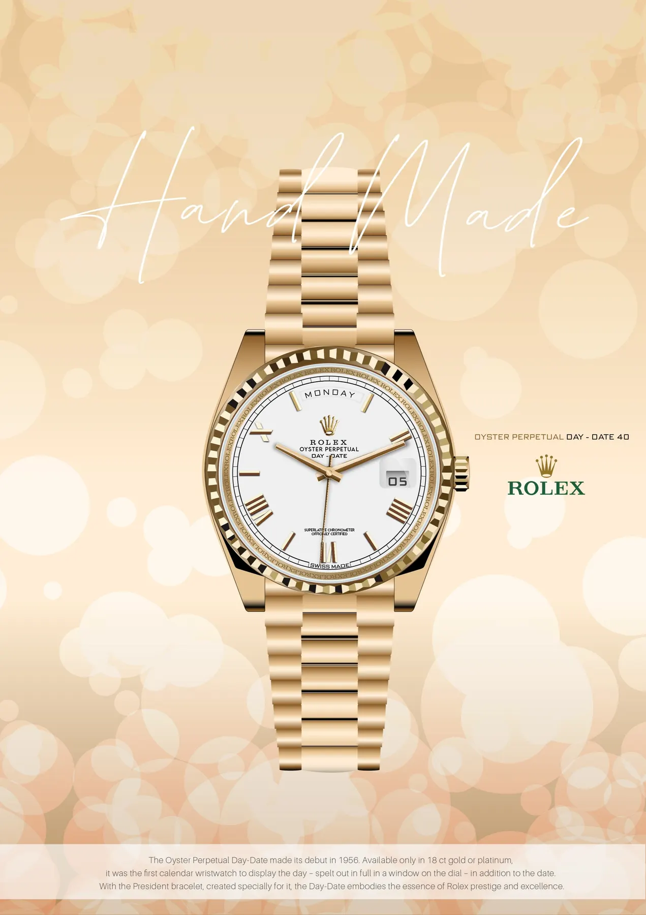
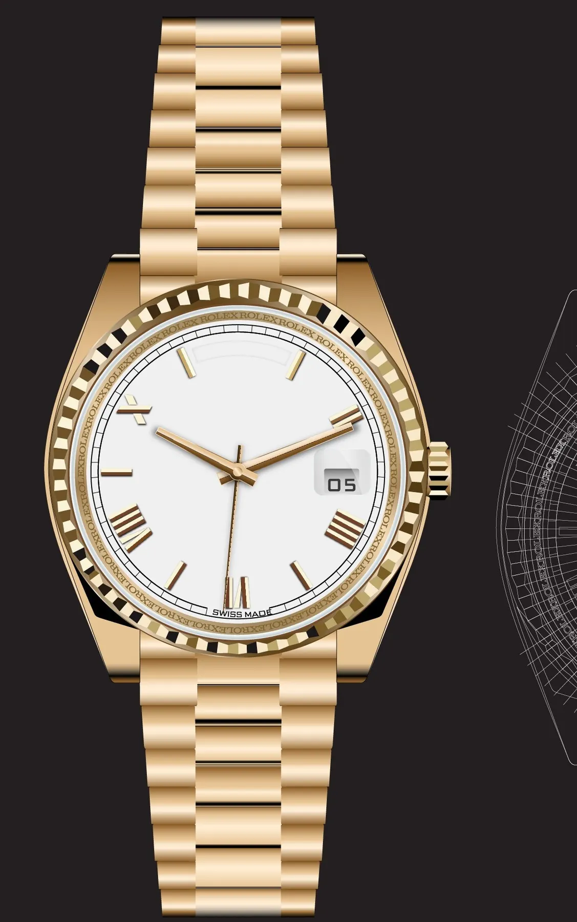
A centred gold Day-Date on soft bokeh: white dial, metallic bracelet, magnified date window, crown, logo placement and a short product note. Simple at first glance, but built on many small Illustrator decisions.
The watch sits vertically in the centre so bracelet, case, dial and crown read as one premium object.
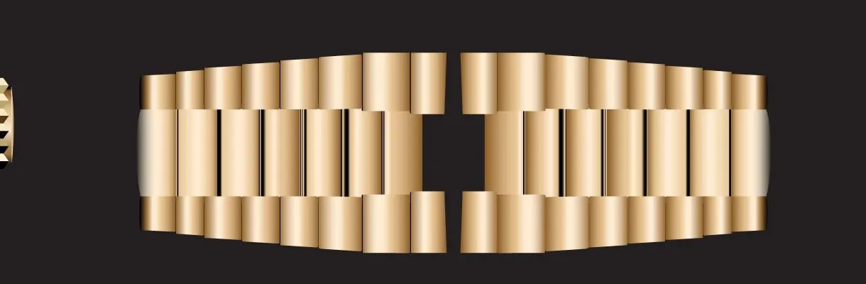
Warm gradients and narrow highlight bands create polished metal without relying on a photo.
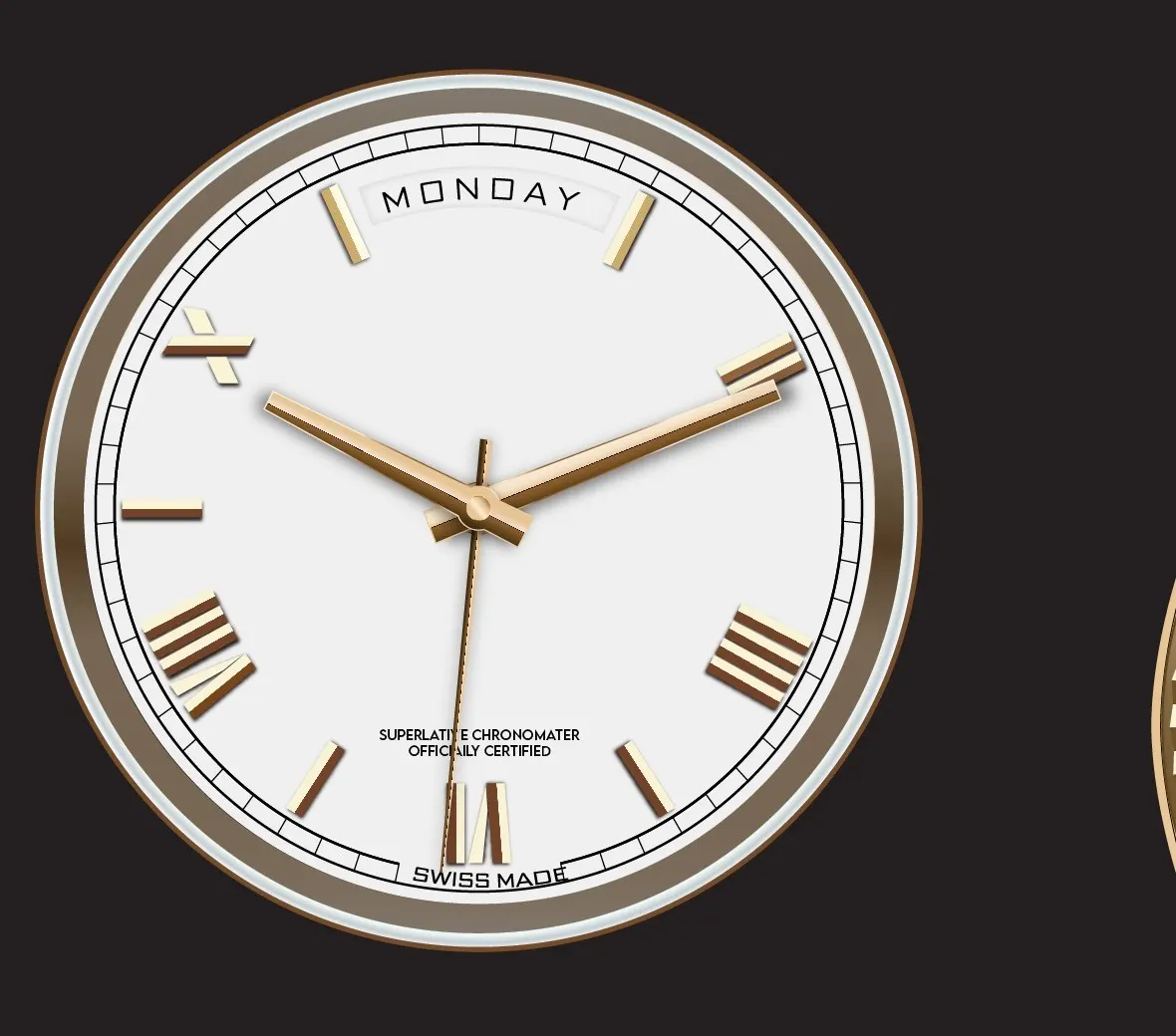
Markers, hands, date glass, day window, logo text and tiny certification lines complete the dial.
At beginner level, the hard part was proving the construction through a full process sheet.
The process was the proof.
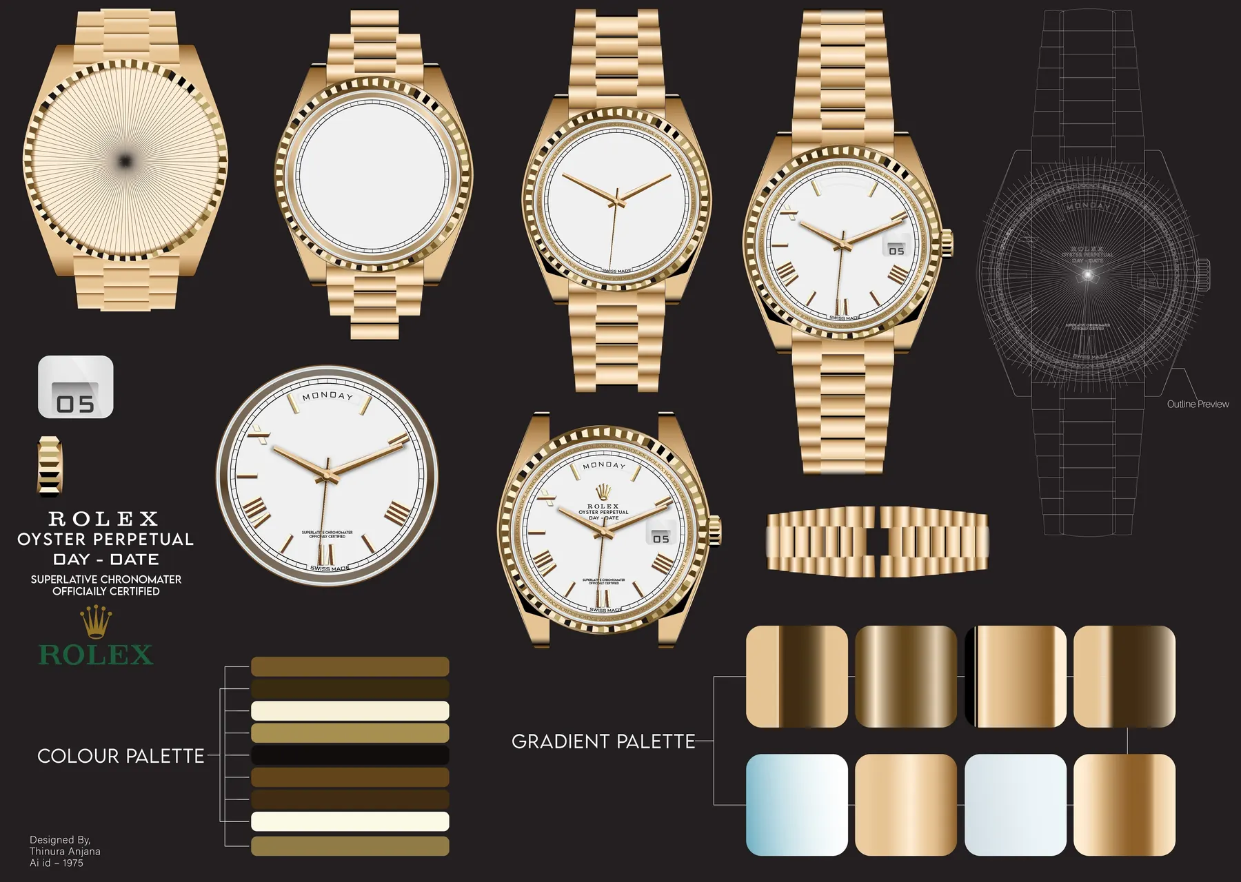
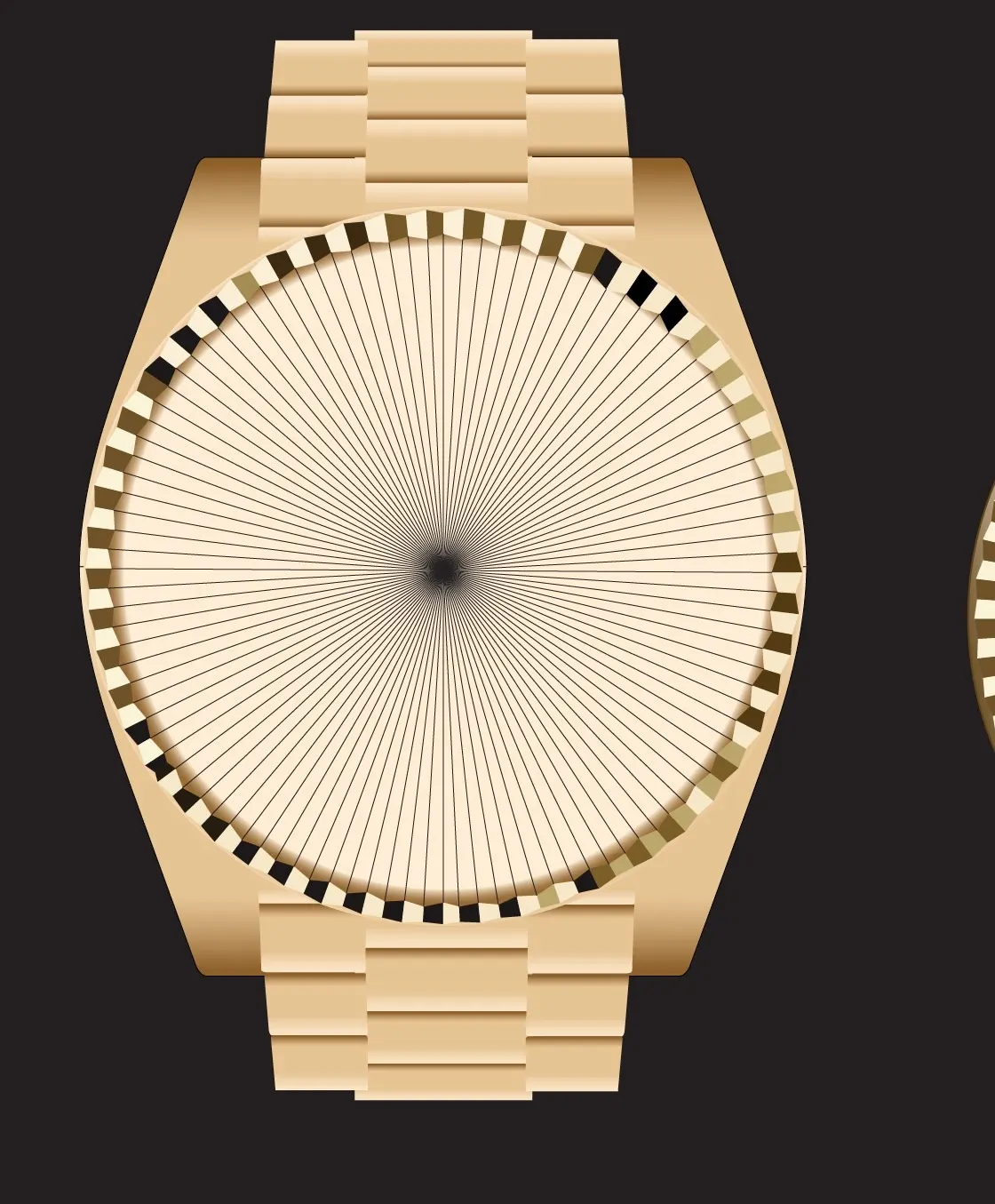
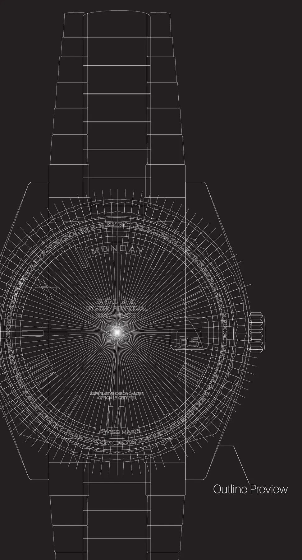
From simple structure to a finished gold render: body construction, dial development, bracelet forms, logo lockup, date window, outline preview, colour palette and gradient palette.
From outline to shine.
Not one flattened poster but a layered illustration system. Every part was shaped, shaded, aligned and finished by hand.
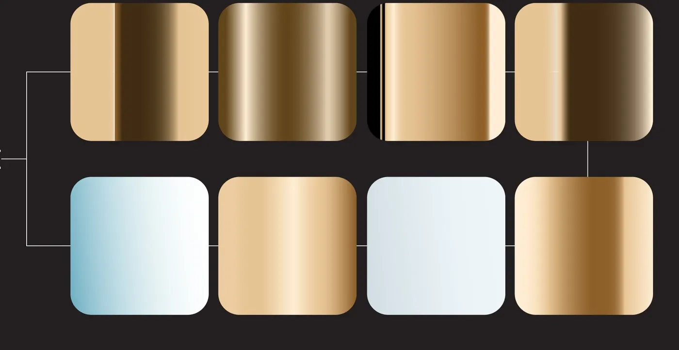

Colour and gradient palette.
Warm and controlled: deep browns for shadow, creamy whites for dial and text contrast, and several gold tones for bracelet and bezel. The gradient blocks show how the metallic look was achieved instead of hiding the method.
A beginner win that became evidence.
It was made while learning the tool, not with a portfolio mindset. But the result proved that careful construction, clean presentation and strong process documentation can stand out at the beginner stage.
Process beats guesswork
The outline and board show the artwork was built layer by layer, not decorated at random.
Gradients create material
The gold works because the gradients follow each part's shape and direction.
Presentation matters
The poster turned a technical exercise into a competition-ready product visual.