FORGE Studio,
built to move.
A personal studio identity shaped around energy, speed and creative momentum: a sharp lightning mark carrying a hidden letter F.
Fast, sharp and forged.
The mark combines a lightning direction with a hidden F. It feels energetic without becoming decorative.
The identity is lean on purpose: a bold mark, a clear wordmark, a warm gold and orange palette, and strict layout rules that keep it clean across print, digital and app use. It began as Master Creations in 2019 and became FORGE Studio in 2025.
Energy first
The lightning form gives instant motion and an active, memorable personality.
Hidden F
The structure quietly forms an F, tying the symbol to the FORGE name.
Angular logic
Sharp cuts and controlled angles say strength, precision and craft.
Flexible use
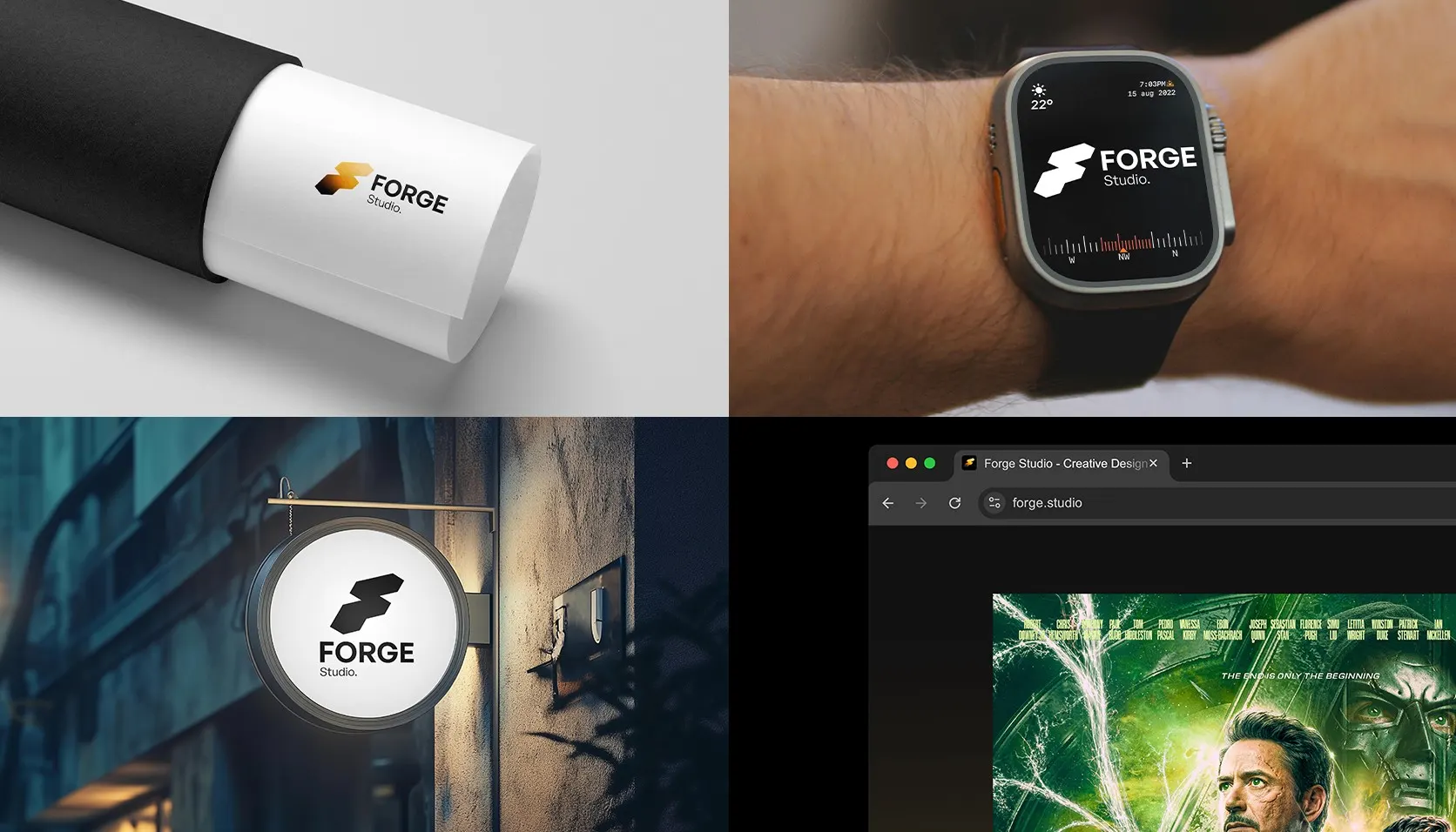
No extra detail, so it stays clear in thumbnails, headers, signage and mockups.
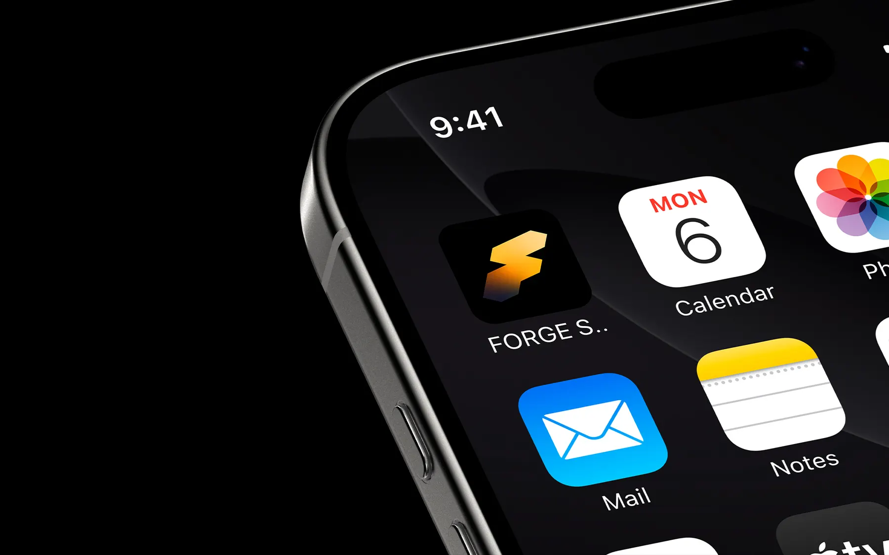
A brand mark and an app icon.
The symbol stands alone where space is tight, or pairs with the wordmark when the name must be clear. Its gradient lives only inside the symbol, never across body text.

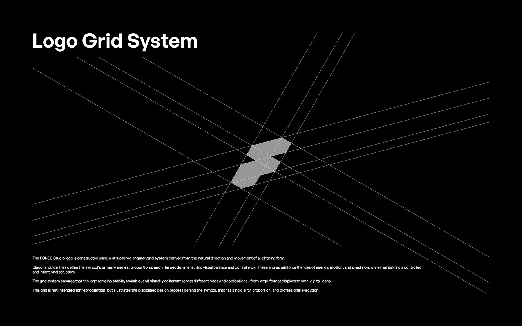
A grid that makes it intentional.
The mark is built from diagonal guides inspired by the direction of lightning. They set the primary angles, proportions and intersections, so the form stays balanced and consistent.
The grid keeps the logo stable, scalable and coherent from large displays down to tiny app icons.
Approved versions only.
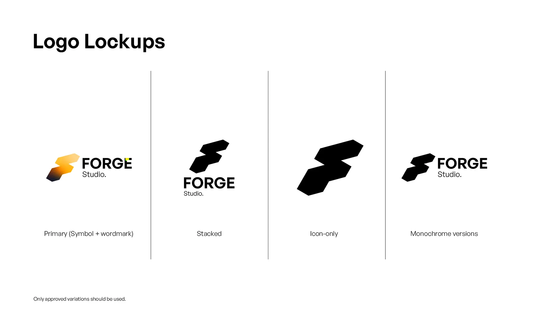
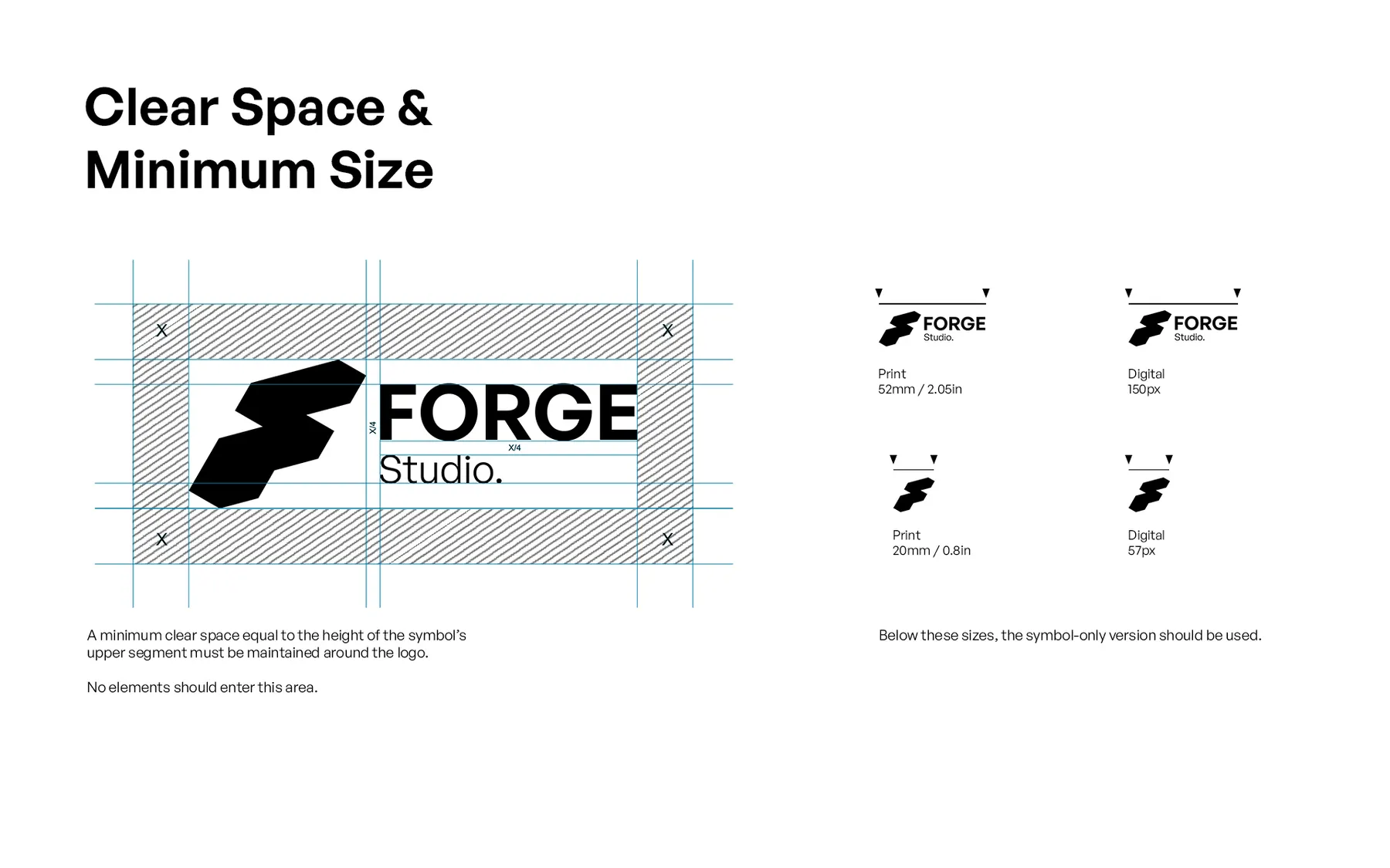
Primary, stacked, icon-only and monochrome lockups, with minimum size and clear-space rules that keep the mark readable in tight layouts.
Keep clear space
Space equal to the upper height of the symbol stays empty around the logo.
Respect size
Below the minimum, use the symbol-only version for legibility.
Approved lockups
Only primary, stacked, icon-only and monochrome versions.
Three colours. One typeface.
Heated Gold, Ember Orange and Forged Steel. General Sans stays clean and neutral so layouts breathe while the mark carries the energy. This website runs on the same system.
Aa
Regular
Explanations, captions and longer reading.
Semibold
Important phrases, labels and small hierarchy shifts.
Bold
When the identity needs a strong, direct voice.
The identity is not decoration. It is a working mark: simple enough to scale, sharp enough to remember, flexible enough to live across the whole studio.
From phone icon to foil.
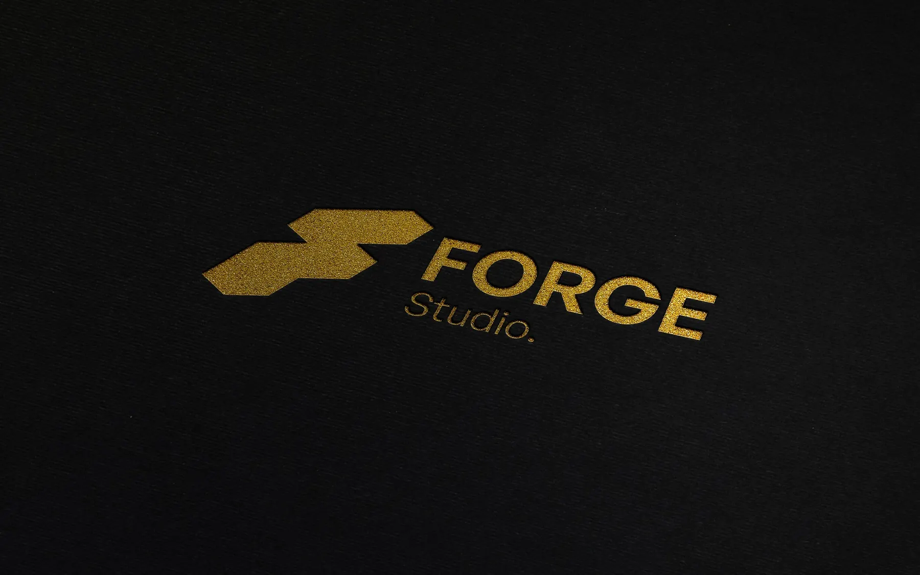
Tested across app icons, screen thumbnails, watch faces, signage, print and premium foil, so it stays recognisable even cropped, small or busy.